Building a Weather Station Dashboard with a Raspberry Pi Self-hosted Data Platform
Follow article
 Dave from DesignSpark
How do you feel about this article? Help us to provide better content for you.
Dave from DesignSpark
Thank you! Your feedback has been received.
Dave from DesignSpark
There was a problem submitting your feedback, please try again later.
Dave from DesignSpark
What do you think of this article?
Using Node-RED to retrieve data from a Davis WeatherLink Live and store this in InfluxDB, with visualisation courtesy of Grafana.
Davis Instruments produce professional and high-end enthusiast weather stations with reasonably long-range wireless, plus optional data logger interfaces and a WiFi bridge. The latter is particularly interesting as this works not only with their cloud platform, but provides a local API that enables integration with custom applications.
In this post, we take a look at creating a weather dashboard that uses the WeatherLink Live local API, together with a self-hosted IoT data platform running on a Raspberry Pi.
Note that this post may prove useful even if you don’t have the exact same hardware and instead would like to use some other HTTP API together with InfluxDB and Grafana, as the overall configuration is likely to be similar.
Davis Vantage VUE
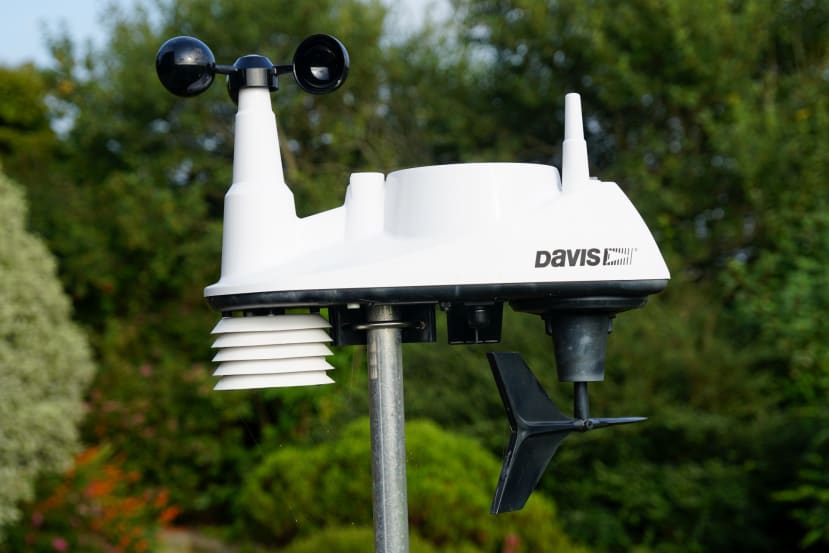
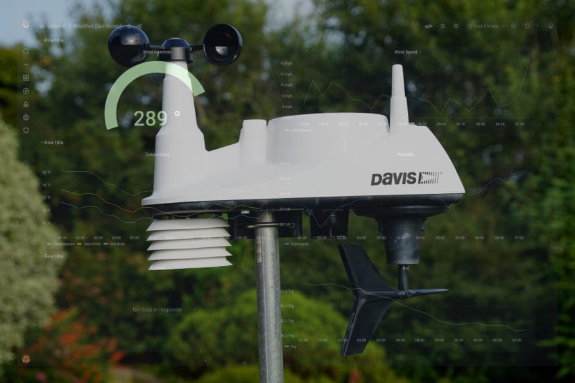
The Davis Vantage VUE weather station is comprised of an Integrated Sensor Suite (ISS) complete with rain collector and anemometer, plus temperature, humidity and wind direction sensors, with frequency hopping spread spectrum (FHSS) wireless that has a range of up to 300m. It is solar-powered and features a supercapacitor, using a lithium primary cell for backup.
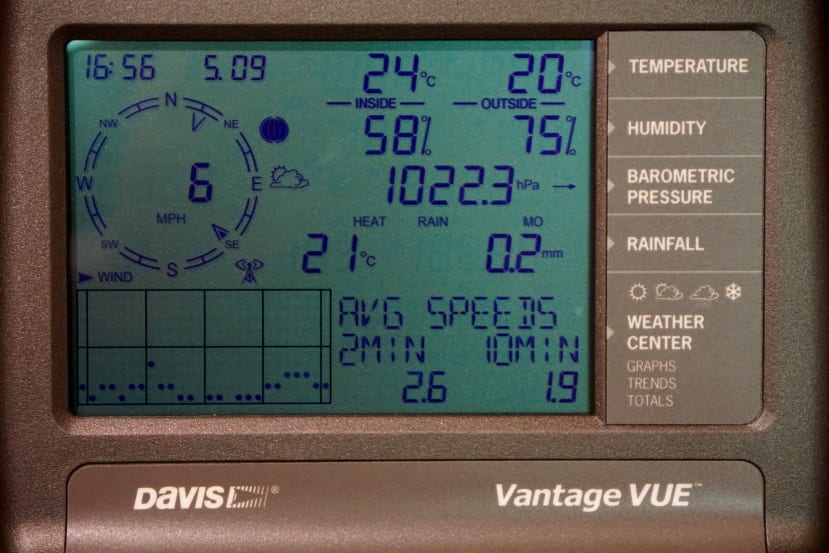
A traditional indoor console provides at a glance viewing of current conditions, plus recent trends.
WeatherLink Live (WLL) provides a bridge between the Davis wireless system and WiFi, with support for connecting up to 8x weather stations or sensor transmitters. Examples of the latter including solar radiation, UV and leaf/soil moisture. There are smartphone apps for viewing data via the WLL and it can also push this up to the Weatherlink cloud subscription service. However, we’ll be making use of its local API and with our own locally hosted data platform.
Testing the API
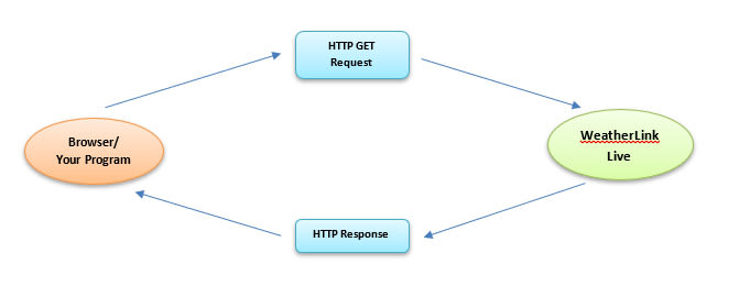
Documentation for the local API is available on GitHub and two endpoints are provided. The main one is HTTP based and can support continuous requests as often as every 10 seconds. While the provides a real-time broadcast every 2.5s of wind speed and rain over UDP port 22222.
To retrieve the current conditions over the HTTP interface we simply need to make a GET request with the following format:
http://<WeatherLink Live’s ip_addr:port>/v1/current_conditions
The response includes a data_structure_type field for each set of conditions returned and this indicates what type of record the JSON object represents, e.g. ISS or leaf/soil moisture current conditions.
We can use the curl command-line tool to quickly test this.
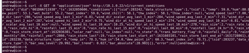
As we can see this works and values are returned, but the output is not the easiest to read. However, one way of prettifying this is to pipe the data returned through Python’s json.tool module.

Software stack

We’ll be using the software stack that was covered in the previous article, Raspberry Pi 4 Personal Data Centre part 3: A Self-hosted IoT Data Platform. To summarise this provides us with:
- Node-RED for interacting with the API and processing the data which is returned
- InfluxDB for storing time series (chronologically ordered) sensor data
- Grafana for visualising weather conditions
- Setting this up is made much easier by using Docker and Ansible.
The Ansible configured stack also includes the Mosquitto broker and although we won’t be using MQTT here, this could come in useful if we had other devices we wanted to integrate, e.g. additional sensor nodes or perhaps a custom display or some other form of output.
Tthe aforementioned blog post should be read in conjunction with this one.
Node-RED Flow
Node-RED should be available on port 1880 and in our case the URL was:
http://cloud.local:3000
To start with we’ll recreate the earlier curl test with Node-RED and for which we need to wire an inject node to a HTTP request node, with the output of this wired in turn to a debug node.
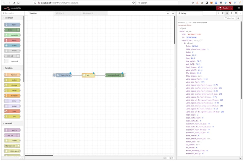
The HTTP request node is configured with the same URL, to make a GET request and to return a parsed JSON object.
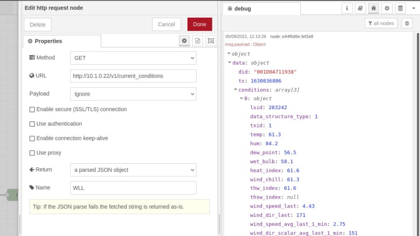
Whenever the inject node triggers, we see the formatted JSON output in the debug window.
However, we want to extract only the conditions that we are interested in and create an array with key/value pairs, that we can then store in a time series database. To do this we create a function node with the following JavaScript code:
if (!msg.payload.data) return

const measurements = ['temp', 'hum', 'dew_point', 'wet_bulb',
    + 'wind_chill', 'wind_speed_last', 'wind_dir_last',
    + 'rainfall_last_15_min', 'bar_sea_level'];

const conditions = msg.payload.data.conditions

var output = [];

conditions.forEach(function (cond) {
    for (const [measurement, value] of Object.entries(cond)) {
        if (measurements.includes(measurement)) {
            output.push({
                measurement,
                payload: value
            })
        }
    }
})

return [ output ];
This function will process the nested JSON object and:
- Check that we have a data node and exit if we don’t.
- Define an array with the measurements that we are interested in.
- Iterate over the nested JSON object that we received via the API and take the key/value pairs for the measurements of interest and store these in a new array.
As can be seen from the earlier tests, the API returns quite a lot of key/value pairs, including period totals calculated by the WLL, plus things like timestamps. Clearly, we don’t want to store all of these things in our time-series database, as we can compute our own period totals etc. Hence we have an array called measurements where we explicitly list those that we’re interested in.

We then wire the output of the function node to an influxdb out node.
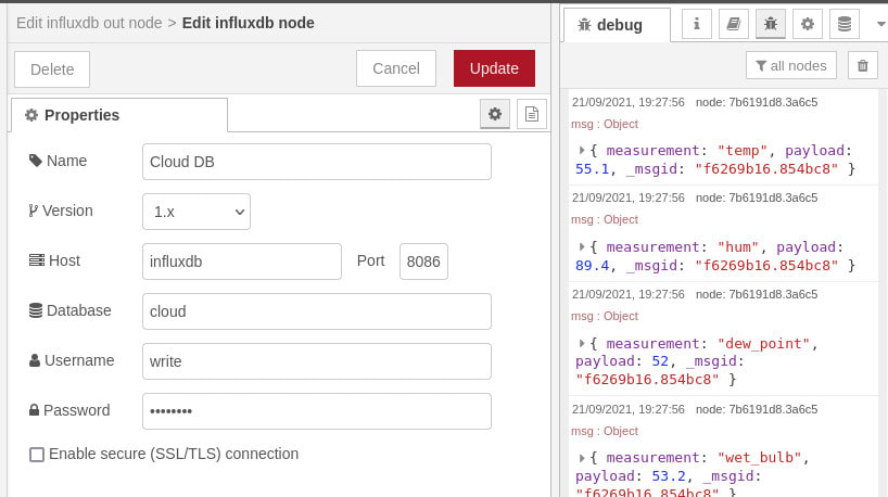
This has a server configured called Cloud DB, with the hostname set to influxdb and not simply localhost, since we’re using Docker networking and so the hostname should be the same as the container name. The database name, username and password were set in the Ansible playbook that we used to deploy the data platform software stack.
We’ve configure the inject node to trigger every 15m, since the rainfall condition that we’ve selected is for the previous 15m period and most of the other conditions won't change that quickly, with perhaps the exception of wind speed and direction. The function node could obviously be extended to publish to InfluxDB at different intervals for different conditions, or perhaps more frequently when there has been significant change for a given condition.
InfluxDB
We should now have data flowing into InfluxDB and we can quickly confirm this using the command-line client, which can be installed on Linux with:
$ sudo apt install influxdb-clientFollowing which to connect to the database we would enter:
$ influx -host cloud.local -database cloud -username admin -password adminThis could be done either on the Raspberry Pi that is hosting the software stack or any other computer on the network. Also assumes that no changes were made to InfluxDB settings in the Ansible playbook and if there were, these will need to be reflected in the above command.
To list the measurements in the database we enter:
> show measurementsWhich should result in the following output.

And to list values recorded we can use select.

Now on to setting up our Grafana dashboard!
Grafana
Grafana should be available on port 3000 and in our case the URL was:
http://cloud.local:3000
The username and password should be set to admin/admin, unless changed in the Ansible playbook.
If we haven’t made use of Grafana previously, we’ll need to add a data source via Settings → Data sources.

With the following parameters:
- URL: http://influxdb.local:8086
- Access: Server
- Database: cloud
- User: read
- Password: read
Once again assuming that no changes were made to the InfluxDB settings in the playbook.

Next, we can click the + symbol in the left-hand navigation and then select Dashboard.

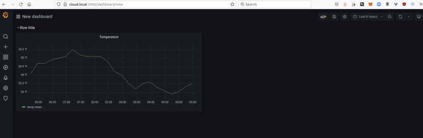
From there select Add an empty panel, setting the title to Temperature. The Data source should default to the InfluxDB Cloud database. Under the empty plot there is a query editor and in the line starting FROM we can pick temp as the measurement. In the SELECT row, we well see that this defaults to value for the field and mean as the aggregation. This “mean” default can be a little confusing at first, but what this means is that when necessary the mean will be computed and a good example would be when we zoom out and want to show data over multiple days or more, where plotting a point for every 15 minutes just wouldn’t make sense.

It’s important to remember that what’s happening here is that Grafana is constructing an InfluxDB query string and we want this to be efficient. We can click the Query inspector button to see the actual query — which we could also run from the InfluxDB CLI — along with the query time etc.

We can use the panel on the right to edit graph styling and configure for things such as connecting null points, along with setting units, a min/max should we wish, plus colours thresholds etc.

When we’re done editing the graph we can select Apply, return to the dashboard view and resize the panel if we wish.
Next, we decided to add a new Row, which is a grouping that can be collapsed, then following which shrunk the temperature panel to make space for one alongside it.

A new panel was added for humidity, with the measurement and units set accordingly. The line colour was changed from the default of green, by clicking on the legend on the plot. After applying the settings we were returned to the dashboard and you can see above that we then zoomed out to a period spanning the last 12 hours.

Next, we added a new row for wind conditions and following which a new panel. However, the default visualisation of Time series was changed via the drop-down top-right to type Gauge. The panel title was set, the unit to angle/degrees and min/max to 0 and 360. The threshold was also removed as we don’t want this to turn red above a certain value.

Finally, we went back and edited the temperature panel, adding queries for dew point and wet bulb. Also adding panels for rainfall and bar, and setting aliases on condition plots, so that these have a friendly name rather than the InfluxDB measurement and aggregation type.

Wrapping up

In this post, we have seen how in no time at all we can set up a data platform stack via Docker and Ansible, following which configuring Node-RED to poll an API, parse the returned data and store this in InfluxDB, which is then visualised via a Grafana dashboard.
There is actually a lot more we could do in terms of handling returned data within Node-RED, processing this and storing it. Indeed, we could also retrieve weather forecast data via a cloud API and store and plot this, should we wish, to provide a forecast alongside current conditions, and perhaps a historical side-by-side comparison of the two. Similarly, we have only scratched the surface of what is possible with Grafana and with this, we are able to present the data in many different ways and to configure alerts, for example.
Comments